
Viewport Resizer: Ultimate Device Emulator & Website Testing Tool
Emulate devices, resize viewports, and test responsive web designs with touch simulation and breakpoint guides.
What it does
Permissions and access
Taken from the extension's own manifest file inside the package. The store listing does not spell this out, so it is worth reading before you install.
| Permission | What it allows |
|---|---|
activeTab | Access the current tab when you click the extension |
declarativeNetRequest | Block or modify network requests |
scripting | Run its own code on pages |
storage | Store its own settings and data |
Requests 4 permissions — extensions doing the same job average 3.9.
Technical details
Show all 41 languages
Description
Viewport Resizer: Ultimate Device Emulator & Website Testing Tool is a browser extension that helps web designers and developers test and showcase their websites across a wide range of devices, from small wearables to large desktop monitors. It provides a professional-grade environment for responsive design testing, allowing you to emulate device screens, resize viewports, and debug layouts without leaving your browser.
Key Features
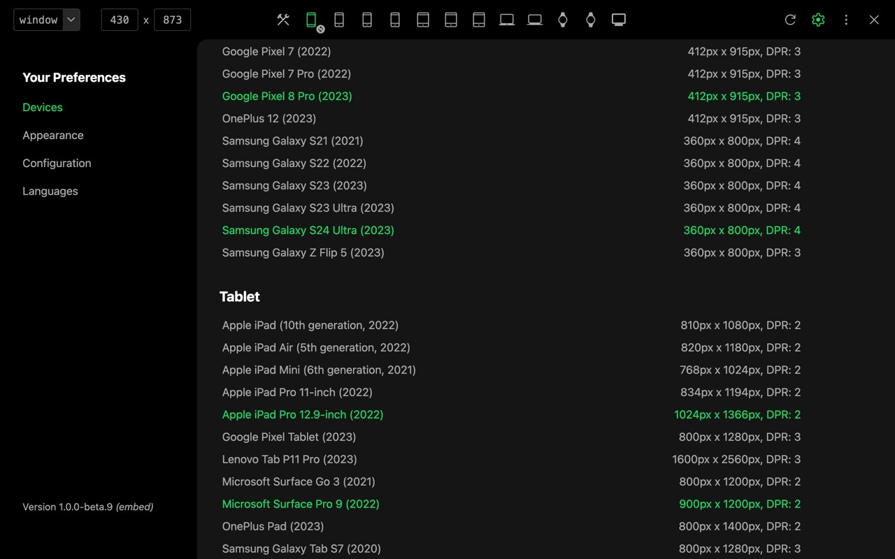
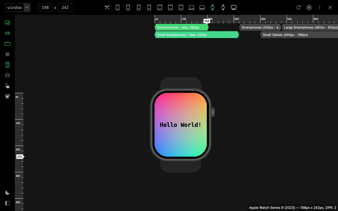
- Device Emulation: Choose from a comprehensive library of device presets, including popular smartphones, tablets, and laptops, to see how your site renders on different screen sizes and resolutions. You can also create custom device mockups with specific dimensions and user-agent strings.
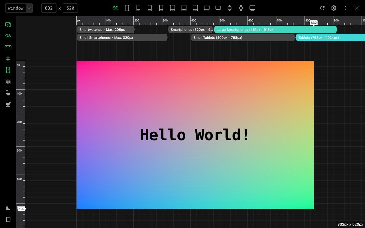
- Viewport Resizing: Manually resize the viewport to any custom width and height, or use the built-in resolution explorer to test common breakpoints. This is useful for identifying layout shifts and ensuring your design adapts smoothly.
- Touch Fingerprint Simulation: Emulate touch events and gestures, such as tap, swipe, and pinch, to test touch interactions on devices that normally use a mouse. This is essential for debugging mobile-specific behaviors like touch targets and scrolling.
- User-Agent Emulation: Override the browser's user-agent string to mimic specific devices or browsers. This helps test server-side content delivery, redirects, or features that depend on user-agent detection.
- Breakpoint Guides: Display visual guides at common breakpoints (e.g., 320px, 768px, 1024px) to align your design with responsive grid systems. You can customize these guides to match your project's breakpoints.
- Zoomable Workspace: Zoom in and out of the emulated viewport to inspect fine details or get an overview of the layout. The workspace supports smooth zooming and panning for precise adjustments.
- Ruler and Grid Tools: Overlay a pixel ruler or a customizable grid on the page to measure elements and align components. These tools aid in pixel-perfect design and debugging spacing issues.
- Coffee Mode Presentation: A sleek presentation mode that hides browser chrome and distractions, allowing you to showcase your design to clients or stakeholders in a clean, focused view. It's ideal for demos and reviews.
- Professional Debugging Environment: The extension integrates with browser developer tools, so you can inspect elements, view console logs, and debug JavaScript while in emulation mode. This streamlines the workflow for developers.
While Viewport Resizer provides a first-level approximation of how a website looks and feels across devices, it does not replace the need for physical device testing. Use it to catch layout issues early in development, but always test on real hardware for final validation of performance, touch responsiveness, and hardware-specific features.
Extensions that do the same job
Matched by what these extensions actually do, not by store category, and sorted so the ones asking for the least access come first.
| Extension | Site access | Permissions | Users | Rating |
|---|---|---|---|---|
| Viewport Resizer: Ultimate Device Emulator & Website Testing Tool — this page | All sites | 4 | 80K | 4.2★ |
| Figma | Limited | 4 | 200K | 4.2★ |
| GitZip for github | Limited | 2 | 100K | 4.1★ |
| IP Address and Domain Information | Limited | 1 | 100K | 4.4★ |
| Lightning Studio | Limited | 3 | 100K | 3.9★ |
| Pixel Measurement | Limited | 3 | 100K | 4.5★ |
| AI Code Finder, Alerts, Ask Questions about Papers: CatalyzeX | Limited | 3 | 50K | 4.8★ |
Want the same thing with less access? Figma, GitZip for github, IP Address and Domain Information ask for fewer permissions than this one.
Store data last checked August 14, 2026.